The Artistry and Poetics of Nguyễn Thế Minh
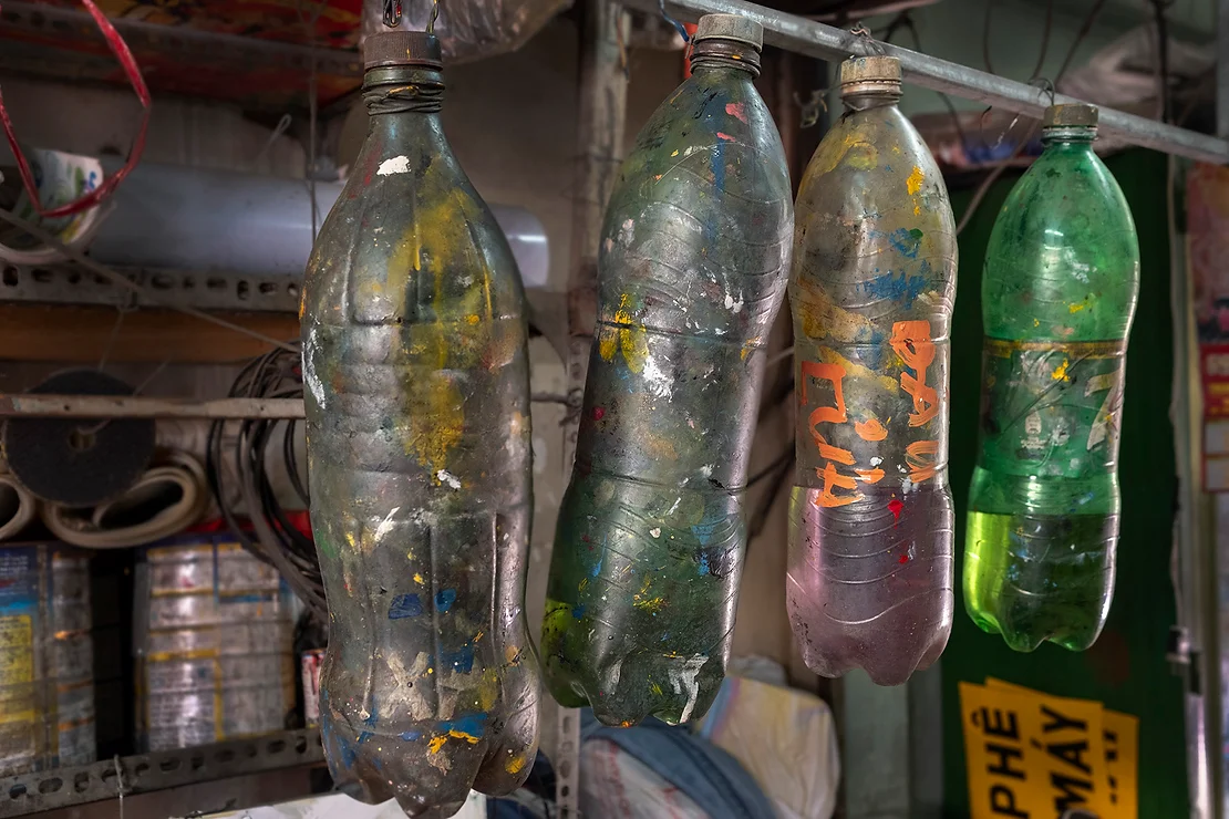
When I first encountered Nguyễn Thế Minh, I immediately knew I was in the presence of a true artist. His cramped studio in Bình Tân, only a few meters square, was overflowing with cans of paint, soda bottles filled with specially mixed colors and stacks of small to medium sized signs.
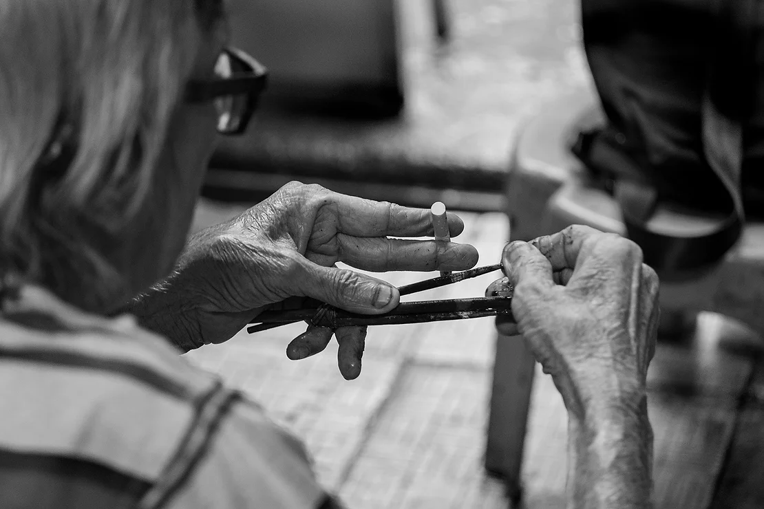
Seated comfortably on a well-worn red fabric sofa, surrounded by photos and articles about his career, Minh was in his element. With his longish silver hair and ever-present cigarette dangling from his fingers, Minh began to impart a bit about his life and artistic career.
As a young boy, he developed a keen interest in poetry and originally wanted to become a poet and philosopher. He even assumed the nom-de-plume of Hoài Minh Phương. But it was his talent for painting that drew the attention of noted artist Hoa Huệ, who took Minh on as an apprentice. He later studied with Vũ Trọng Hợp, and credited both men with shaping his artistic vision. However, upon dealing with reality after 1975, Minh took up the art of hand-lettering on metal signs as a practical profession.
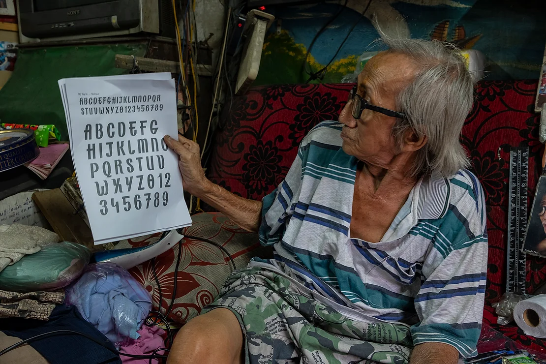
Minh never had any prior formal sign painting experience. Instead he repetitively copied classical type fonts from European workbooks available at the time. Having mastered the basics, he began using his artistic intuition and instinctive expressions.
His method of perfecting his trade was characteristic of the Western disciplined approach. Yet he enhanced it with his own style, which is indicative of the way Vietnamese artists have adapted outside influences to create their own voice.
One reason why Minh’s signs have endured and he has achieved recognition, is his approach to sign painting. He views it as an art rather than a discipline. Flicking an elongated ash off his cigarette, he remarked, “Sign painters have to be good not only at just lettering but at artistic composition. I approach my signs as a blank canvas. They have to be composed well with type fonts and illustrations all in harmonious balance. But most of all, it has to be beautiful.”
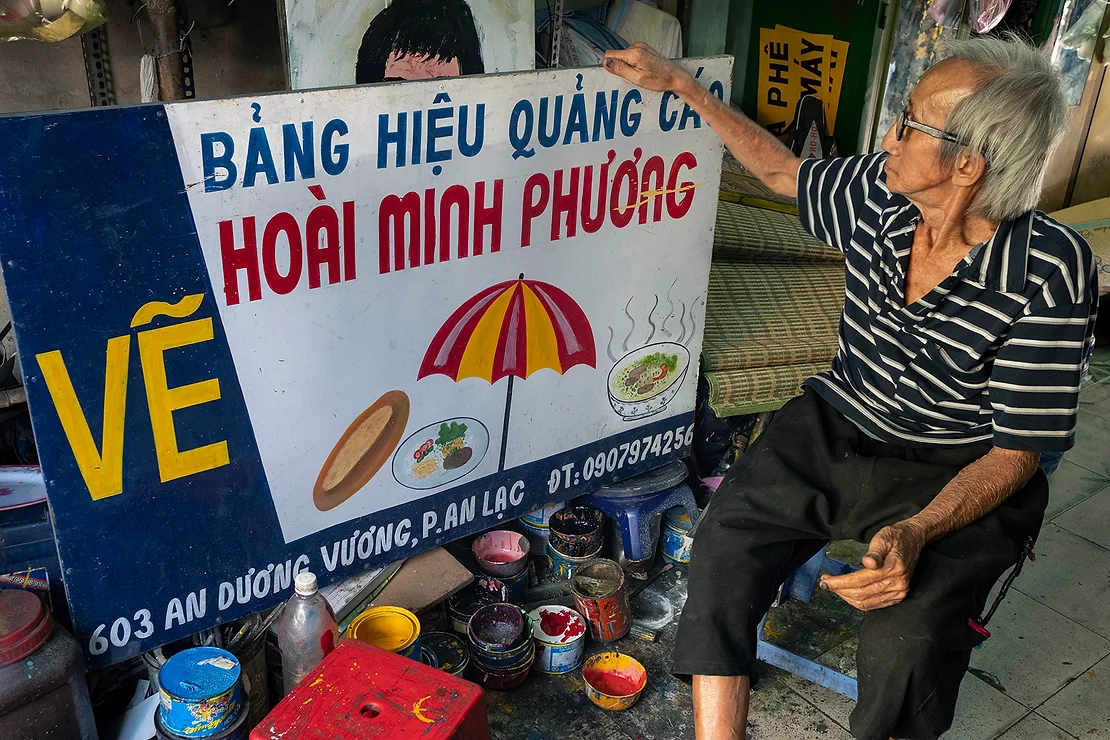
Speaking of composition, I noticed that a number of signs had either an illustration or a poetic verse included. Minh explained, “In order to make my signs stand out, I decided to include illustrations in the composition. Reading about, and being aware of the Modernist Art Movement in Europe, I created whimsical illustrations synonymous with the company that commissioned the sign.”
Minh continued, “My unique script letters were influenced by my love of calligraphy. Although never formally trained in the art, I repetitively practiced, then developed my own trademark flourishes and curves. Not forsaking my love of poetry, I decided to include a few lines that inspired me on different signs. I was fortunate to have a number of clients who granted me the opportunity to include my love of poetry in their signs.”
Behalf Studio, a small Saigon-based creative hideout of prudent thinkers, is headed by Nguyen Giang, a master type designer and graphic artist. He has initiated a project called ‘Republish’ – taking old remnants of type fonts, re-working them and publishing new digital versions for free usage. They have chosen one such relic from a sign on a locksmith’s cart painted by Minh. Giang and his team were impressed at how Minh used his artistic ability to transform from the rigid, disciplined letters and reworked them with his own unique touches.
Minh continued, “I am honored that a young type design team has chosen one of my signs on which to base a new digital font. Giang then added, “I find his approach of going beyond the initial remnant and expanding his artistic interpretations, mimics our own style of type explorations in the digital realm.”
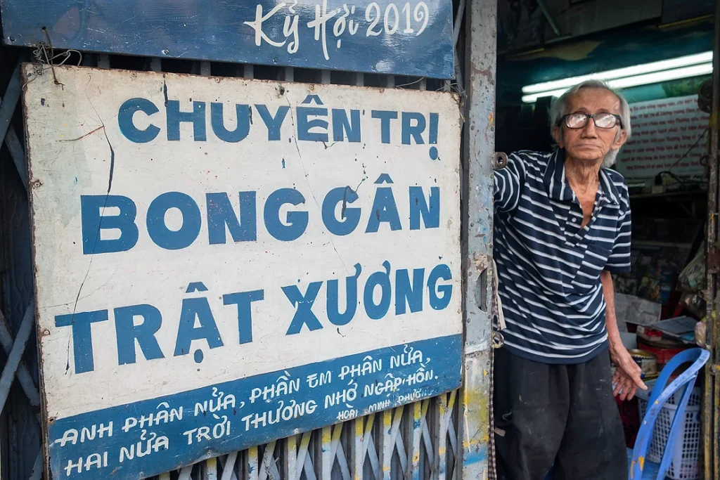
Looking back, Minh confessed, “It wasn’t always easy. With the advent of digitally designed signs and laser printing, demand for my work dropped. There were times when I couldn’t pay my bills and I faced bouts of depression. Fortunately, I had studied and practiced the healing art of curing sprains and dislocated joints. It sustained my family and I through lean times. It is a practice I still carry on today. In addition, my passion for painting and poetry kept my inner flame alive.”
Minh also said that more recently he needs corrective eye surgery but cannot afford it, which slows his working. In addition, the current pandemic means that very few businesses are opening that need signage.
I then asked him to comment on modern, machine-made signs. Minh candidly replied that he was not impressed with any of them. “True, they can turn out a sign in 3-5 hours, whereas mine will take 3-5 days. But they are soul-less and don’t have any real artistic merit.”
When questioned about his recent media notoriety, Minh responded that he was happy that his work was being recognized but that it didn’t affect his artistic vision. “For over a half-century, I was able to sustain myself and my family and have maintained my individuality and unique style.”
It was a privilege to have met the multi-talented Nguyễn Thế Minh – painter, poet, singer and story-teller.
Text and photos are copyright of Jim Selkin in perpetuity – 07 Aug 2020